Documentation
What it does
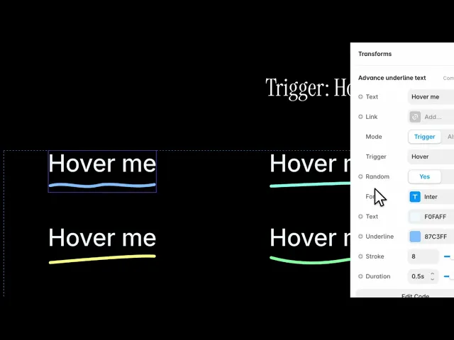
The component renders your text with an SVG underline underneath it. The underline is not a static image: it is drawn stroke by stroke, left to right, the way a pen would draw it. You choose when it draws — on hover, on page load, on click, or permanently visible.
There are twelve underline paths built in, from a near-straight confident line to loops, ripples and scribbles. Every one of them is hand-authored SVG, drawn with the browser's native stroke-dashoffset. Nothing is fetched at runtime and no animation library is bundled.
Where you would use it
Inline links in body copy, where a plain underline looks flat
A single emphasised word in a heading — set Mode to Always so it reads as part of the design rather than as an interaction
Navigation items, on hover
Hero headlines, with Trigger set to On Load so the line draws as the page arrives
How to add it
Paste the component onto your canvas.
Type your text into the Text control.
Set everything else from the properties panel.
The component sizes itself to its content — width and height are both auto, so it behaves like a text layer inside a stack.
Controls
Four controls are conditional and only appear when they are relevant. That is deliberate: the panel never shows you a setting that would do nothing.
Content
Control | Type | Default | Notes |
|---|---|---|---|
Text | String |
| The text that gets underlined. |
Link | Link | — | Optional. Turns the whole component into a link. |
New Tab | Boolean |
| Only appears once Link is set. |
Behaviour
Control | Type | Default | Notes |
|---|---|---|---|
Mode | Trigger / Always |
|
|
Trigger | Hover / On Load / On Click |
| Hidden when Mode is Always — there is nothing left to trigger. |
Hover draws the line on enter and erases it on leave. On Load draws it once when the component appears. On Click toggles it.
Line style
Control | Type | Default | Notes |
|---|---|---|---|
Random | Yes / No |
| Picks one of the twelve styles at random each time it draws. |
Line Style | Style 1–12 |
| Hidden while Random is Yes. Set Random to No to pick a fixed style. |
With Random on and Trigger set to Hover, the same link draws a different underline every time a visitor hovers it. That is playful, and it is the right default for a personal site. For brand work, turn Random off and commit to one style.
Appearance
Control | Type | Default | Notes |
|---|---|---|---|
Font | Font | 24px, Medium, −0.01em, 1.1em | Full typography controls. |
Text | Color |
| Text colour. |
Underline | Color |
| Line colour. Independent of the text colour. |
Stroke | Number |
| Line thickness, 1–30. |
Stroke does not scale with the font. If you raise the font size, raise the stroke to match, or the line will look thin under large text. As a starting point, a stroke of about a third of the font size reads well.
Timing
Control | Type | Default | Notes |
|---|---|---|---|
Duration | Number |
| How long the draw takes, 0.1–2s. |
Under 0.3s the line feels snappy and gets out of the way — right for navigation. Over 1s it reads as decoration, which suits a hero headline and is too slow for a link a visitor is trying to click.
Tips
Match the underline colour to your accent colour, not your text colour. The default pairs near-black text with a violet line for exactly this reason.
Use Always sparingly. One permanently underlined word in a heading is an emphasis; three are noise.
On Load inside a long page: the draw happens when the component appears, so place it above the fold or the visitor will scroll past a finished line and never see it animate.
Performance and limits
No third-party libraries and no runtime requests. The underline is inline SVG and the animation is a native CSS transition on
stroke-dashoffset.The component detects static rendering, so canvas thumbnails and exports show a clean state instead of a half-drawn line.
Because it is a single text layer, it inherits your stack's alignment and wrapping — it does not need a fixed width.
Good to know
No setup or coding required. Responsive across desktop, tablet, and mobile.
Refund policy — due to the nature of digital products, all sales are final. Once purchased, this component is non-refundable. Please make sure it fits your needs before completing the checkout.
Support: hi@alicorak.com