Documentation
What it does
It holds a placeholder while your image loads, fades the real one in when it arrives, and handles the case where it never arrives at all.
That last part is what most image components skip. An image that fails silently leaves a hole in your layout, and this one doesn't.
Controls
21 controls, 6 of which only appear when they are relevant.
Control | Type | Default | Notes |
|---|---|---|---|
Image | ResponsiveImage | — | — |
Placeholder | Enum | Blur Up / Skeleton / Color — default | — |
Blur Image | ResponsiveImage | — | Use a small image for a true blur-up effect. · conditional |
Base Color | Color |
| — |
Skeleton | Color |
| conditional |
Highlight | Color |
| conditional |
Blur | Number |
| 0–60px · conditional |
Delay | Number |
| 0–5e3ms · Simulates a slower load after the image is ready. |
Fade | Number |
| 0–2e3ms |
Lazy Load | Boolean |
| — |
Preload | Number |
| 0–1e3px · Start loading this many pixels before entering view. · conditional |
Fit | Enum | Cover / Contain / Fill / None / Scale Down — default | — |
Position | Enum | Center / Top / Bottom / Left / Right — default | — |
Radius | BorderRadius |
| — |
Fallback | ResponsiveImage | — | — |
Error Text | String |
| — |
Retry | Boolean |
| — |
Retry Label | String |
| conditional |
Test Error | Boolean |
| — |
On Load | EventHandler | — | — |
On Error | EventHandler | — | — |
Working through the panel
The placeholder
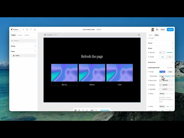
Placeholder is the first decision and it changes which controls you see.
Blur Up shows a tiny blurred version of the picture that sharpens into the real one. Pick it and you get a Blur Image field and a Blur amount. It's the best-looking option because the placeholder already has the right colours in the right places.
Skeleton shows a shimmering grey block, and reveals Skeleton and Highlight colours. Use it when the image is content rather than atmosphere — a product photo you don't want to preview.
Color is the simplest: a flat Base Color and nothing else.
Loading behaviour
Lazy Load is on by default, which means the image only downloads when it approaches the viewport. Preload appears alongside it and sets how far ahead — the distance in pixels before the image enters view that the download starts.
Raise Preload if visitors scroll fast and you're seeing placeholders. Lower it to save bandwidth on a long page.
Delay is an artificial pause before the image is shown, and Fade is how long the transition takes. Delay exists to stop a fast-loading image flashing through its placeholder — a placeholder that appears for thirty milliseconds is worse than none.
When it fails
This is the part worth setting up.
Fallback is an image shown instead when the original can't load. Error Text is the message if there's no fallback. Retry adds a button, with its own label, letting the visitor try again — which genuinely helps on a flaky connection.
And Test Error is a switch that forces the failure state so you can design it. Turn it on, style the error, turn it off. Don't ship it on.
There are also On Load and On Error event handlers if something else on the page needs to know.
Performance and limits
Static rendering is handled, so canvas thumbnails and exports show a settled frame rather than a blank box.
Good to know
No setup or coding required. Responsive across desktop, tablet, and mobile.
Refund policy — due to the nature of digital products, all sales are final. Once purchased, this component is non-refundable. Please make sure it fits your needs before completing the checkout.
Support: hi@alicorak.com