Documentation
What it does
A floating button that appears once the visitor has scrolled far enough, and returns them to the top of the page.
It stays hidden until it's useful, which is the part people usually get wrong when they build one by hand.
Controls
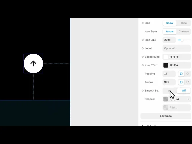
12 controls, 3 of which only appear when they are relevant.
Control | Type | Default | Notes |
|---|---|---|---|
Show After | Number |
| 0–2e3px · Pixels scrolled before the button appears. |
Icon | Boolean |
| — |
Icon Style | Enum | Arrow / Chevron — default | conditional |
Icon Size | Number |
| 10–48px · conditional |
Label | String | — | — |
Background | Color |
| — |
Icon / Text | Color |
| — |
Padding | Padding |
| — |
Radius | BorderRadius |
| — |
Smooth Scroll | Boolean |
| — |
Shadow | BoxShadow |
| — |
Label Font | Font |
| conditional |
Working through the panel
When it appears
Show After is how far down the page the visitor has to be before the button arrives, in pixels.
Set it to roughly one screen height. Lower and the button appears while the top of the page is still visible, which is pointless. Higher and it shows up too late to be the thing that saves a long scroll.
Smooth Scroll animates the journey back rather than jumping. Leave it on — a sudden jump to the top is disorienting, because nothing tells the visitor the page moved rather than changed.
Icon and label
Icon is on by default, with a choice of arrow or chevron and a size to match your button.
Label is empty by default, and adding text turns it into a wider pill instead of a circle. A font control appears once you do.
Icon alone is right for most sites. A label is worth it when your audience is less used to the convention, or when the page is very long and you want the affordance to be unmissable.
Styling
Background and icon colour, padding, corner radius and a shadow.
The radius starts fully round, which is the safe default because it reads as a control rather than as content. Square it off only if your design language has no circles in it anywhere.
And keep the shadow. The button floats over the page, and without a shadow it looks pasted onto whatever happens to be scrolling underneath it.
Performance and limits
Static rendering is handled, so canvas thumbnails and exports show a settled frame rather than a blank box.
Good to know
No setup or coding required. Responsive across desktop, tablet, and mobile.
Refund policy — due to the nature of digital products, all sales are final. Once purchased, this component is non-refundable. Please make sure it fits your needs before completing the checkout.
Support: hi@alicorak.com