Documentation
What it does
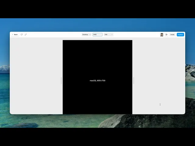
It prints the visitor's current viewport dimensions as plain text, and updates them live as the window changes.
Two controls — a colour and a font — because there's nothing else to configure. It's a readout, not an effect.
Where you would use it
Responsive testing, where you want the actual number rather than a guess at which breakpoint you're in. Development and staging pages. Style guides and internal tools.
And it turns up in experimental layouts too, where showing the visitor their own screen size is part of the design.
Controls
2 controls.
Control | Type | Default | Notes |
|---|---|---|---|
Color | Color |
| — |
Font | Font |
| — |
Performance and limits
Static rendering is handled, so canvas thumbnails and exports show a settled frame rather than a blank box.
Good to know
No setup or coding required. Responsive across desktop, tablet, and mobile.
Refund policy — due to the nature of digital products, all sales are final. Once purchased, this component is non-refundable. Please make sure it fits your needs before completing the checkout.
Support: hi@alicorak.com