Documentation
What it does
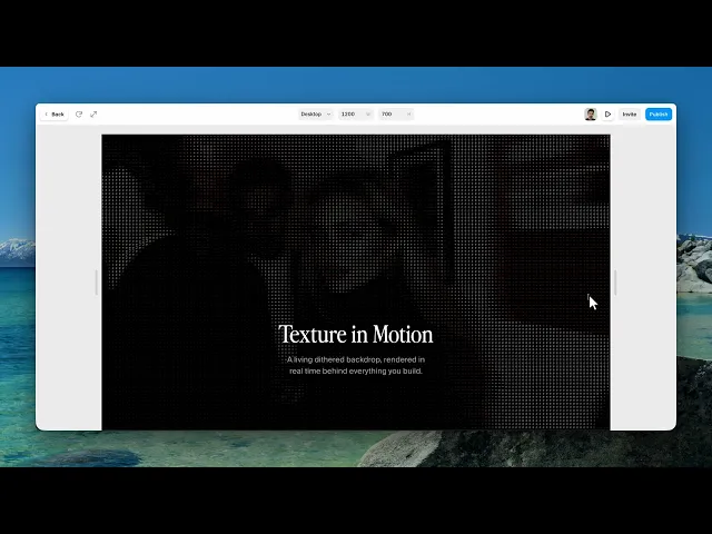
The component samples your media on a grid and replaces each cell with a character picked from a ramp — sparse characters where the image is dark, dense ones where it is bright.
A still image is converted once. A video is re-converted frame by frame, so the characters visibly reshuffle as the footage moves.
Everything is configurable: the grid size, which characters the ramp uses, and whether the result keeps the original colour or collapses to one.
Where you would use it
Hero backgrounds, where a photograph would be too literal
Portraits and artwork, made abstract enough to sit behind text
Looping video, which is where the effect is most alive — the characters visibly reshuffle as the footage moves
The effect eats detail by design. Choose source media with strong shapes and clear contrast; fine detail is the first thing the grid destroys.
How to add it
Paste the component onto your canvas.
Choose a Media Type — Image or Video.
Set the matching source control.
Adjust Cell Size until the character grid reads the way you want.
Controls
Source
Control | Type | Default | Notes |
|---|---|---|---|
Media Type | Image / Video |
| Which source the rest of the panel expects. |
Image | Image | — | Only on Image. |
Video File | File | — | Only on Video. Uploaded file. |
Video URL | String | — | Only on Video. Hosted URL instead of an upload. |
Playing | Boolean |
| Plays or pauses the video. |
Video File and Video URL are alternatives, not a pair — use whichever suits. An upload keeps everything in the project; a URL keeps the project light.
Playing only affects video. An image is converted once and then sits there; there is no loop to stop.
The character grid
Control | Type | Default | Notes |
|---|---|---|---|
Cell Size | Number |
| 3–32px. Size of one character cell. |
Ramp | String |
| Characters ordered dark → light. |
Font Family | String | system monospace stack | Must be monospaced. |
Cell Size is the single most important control here. Small values keep the picture readable and the text becomes texture; large values destroy the picture and the characters become the subject. There is no correct answer — but pick a side, because the middle reads as a mistake.
The Ramp is where the personality lives. The order matters, not the characters themselves: the leftmost is drawn where the image is darkest. A short ramp like .:-=+*# gives hard, posterised steps; a long one gives smooth gradation. Replacing it with your own set — including letters from a word — is the fastest way to make the effect feel bespoke.
Font Family must be monospaced or the grid will not line up. The default stack already resolves to the right font on every platform; only change it if you are deliberately using a specific mono typeface.
Colour
Control | Type | Default | Notes |
|---|---|---|---|
Color | Original / Monochrome |
| Keep source colour, or collapse to one. |
Text Color | Color |
| Only on Monochrome. |
Background | Color |
| Behind the characters. |
Invert | Boolean |
| Flip the ramp mapping. |
Monochrome is the setting that makes this usable as a background. In Original mode the characters carry the photograph's colours and compete with anything placed over them. One text colour against one background is calm enough to put a headline on.
Invert swaps which end of the ramp is dark. It is the difference between characters appearing in the highlights and appearing in the shadows, and it is worth toggling on every image — one of the two almost always looks better.
Image adjustment
Control | Type | Default | Notes |
|---|---|---|---|
Contrast | Number |
| 0–3. |
Brightness | Number |
| 0–3. |
These act on the source before it is sampled, so they change which characters get chosen, not just how the result looks. Raising Contrast is the standard fix for a muddy result: it pushes the source toward the ends of the ramp and gives the grid clearer decisions to make.
Layout
Control | Type | Default | Notes |
|---|---|---|---|
Fit | Cover / Contain |
| How the source fills the frame. |
Tips
Raise Contrast first, then adjust Cell Size. Most disappointing results are a contrast problem being mistaken for a resolution problem.
For a background behind text: Monochrome, a low-contrast pairing of Text Color and Background, and a small Cell Size. Then place your headline over it.
Custom ramps beat the default for brand work. Try the letters of your own name or product, ordered from thin to dense.
Performance and limits
An image costs one conversion, not a loop. Use images freely.
Video is capped at 30fps, and both the conversion and the video itself pause once the component scrolls out of view — so a video instance below the fold costs nothing until it is reached.
Fine detail and small text in the source will not survive. That is inherent to the technique, not a setting to fix.
Video needs to be encoded for the web and hosted somewhere permissive — a URL that blocks cross-origin requests will not draw.
Good to know
No setup or coding required. Responsive across desktop, tablet, and mobile.
Refund policy — due to the nature of digital products, all sales are final. Once purchased, this component is non-refundable. Please make sure it fits your needs before completing the checkout.
Support: hi@alicorak.com