Documentation
What it does
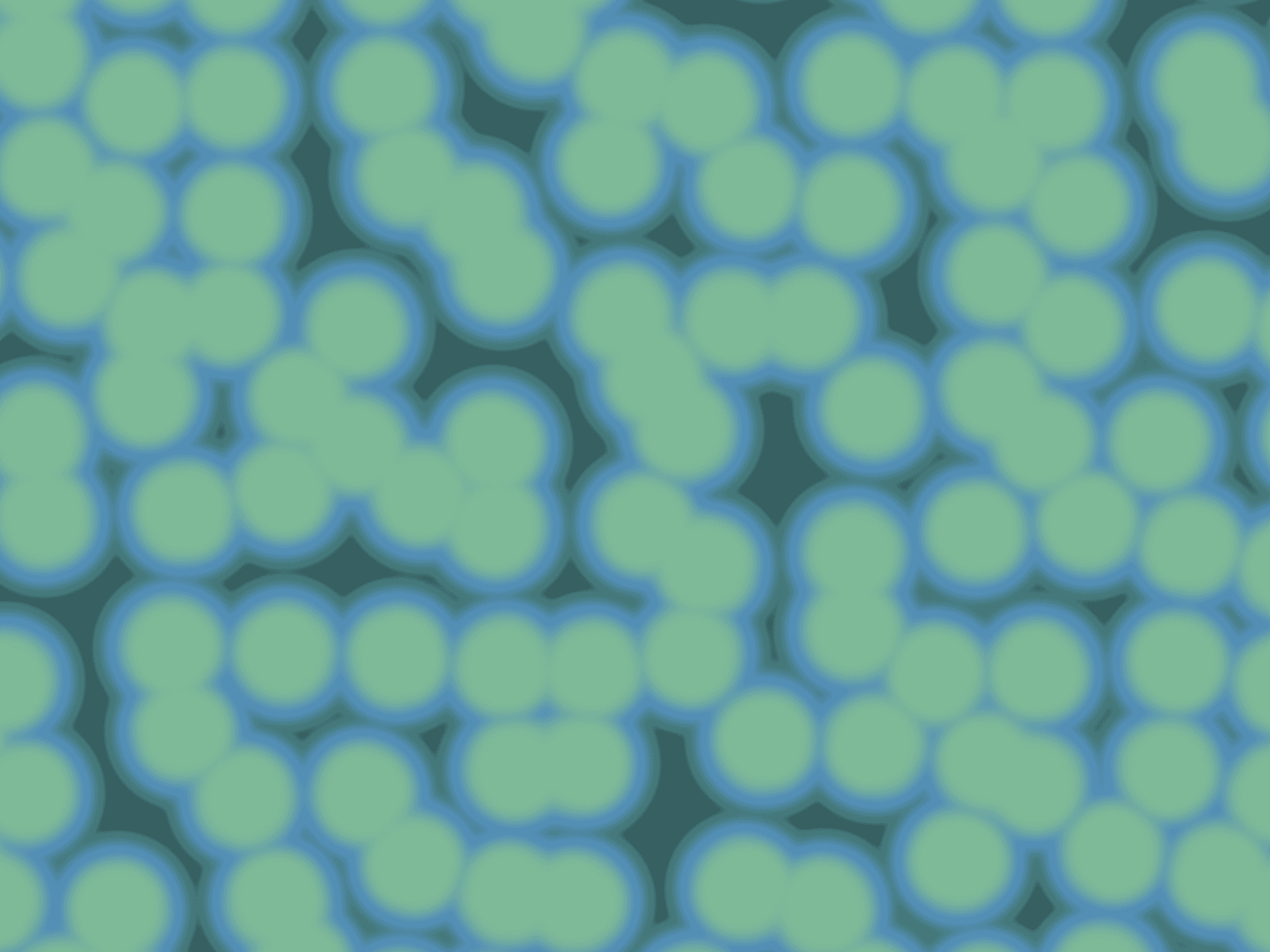
Your photograph reduced to a handful of colours and rebuilt with a dither pattern — the way images looked on machines that couldn't afford more than a few colours at once.
It's an aesthetic with a real constraint behind it, which is why it reads as authentic rather than as a filter.
Controls
13 controls, 5 of which only appear when they are relevant.
Control | Type | Default | Notes |
|---|---|---|---|
Image | ResponsiveImage | — | — |
Type | Enum | Random / 2×2 / 4×4 / 8×8 — default | — |
Pixel Size | Number |
| .5–20 |
Color Steps | Number |
| 1–7 |
Colors | Boolean |
| — |
Front | Color |
| conditional |
Back | Color |
| conditional |
Highlight | Color |
| conditional |
Inverted | Boolean |
| — |
Fit | Enum | Cover / Contain — default | — |
Animate | Enum | None / On Reveal / On Hover / Both — default | — |
From Size | Number |
| 1–20 · Coarse pixel size of the dithered state · conditional |
Duration | Number |
| .2–4s · conditional |
Working through the panel
The dither
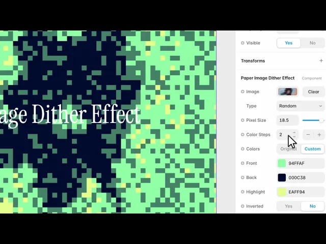
Type is the pattern: random, or ordered matrices at two by two, four by four and eight by eight.
The ordered ones give you the visible cross-hatch grid people recognise from early computing. Random gives noise instead, which reads more like film grain than like a screen.
Pixel Size is how large each cell is. Larger is bolder and hides more of the photograph.
And Color Steps is how many levels the image is reduced to — the actual constraint. Two is stark and graphic. Seven keeps much more of the original.
Colour
By default it uses the photograph's own colours, reduced.
Turn on Colors and three controls appear — front, back and highlight — so the whole image is remapped into your palette instead. That's how you get the green-on-dark-blue terminal look, or match a photograph to a brand.
Inverted flips light and dark, and it's worth trying on every image.
Fit is cover or contain.
Animation
Animate has four settings: none, on reveal, on hover, or both.
Pick any of the active ones and two controls appear. From Size is the pixel size the animation starts at, and Duration is how long it takes.
Starting from a large pixel size and resolving down is the effect worth having — the image assembles out of blocks as it scrolls into view, which is a reveal with a reason rather than a fade.
Performance and limits
It stops rendering when it scrolls out of view and when the browser tab is hidden, so an instance below the fold costs nothing until the visitor reaches it.
Static rendering is handled, so canvas thumbnails and exports show a settled frame rather than a blank box.
It renders with WebGL at whatever size and pixel density the frame needs — there is no image to download and no resolution to outgrow.
Good to know
No setup or coding required. Responsive across desktop, tablet, and mobile.
Refund policy — due to the nature of digital products, all sales are final. Once purchased, this component is non-refundable. Please make sure it fits your needs before completing the checkout.
Support: hi@alicorak.com