Documentation
What it does
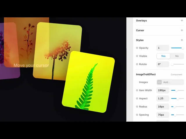
Moving the cursor across it drops your images along the path, one after another, and each one animates away as the next arrives.
It's a gallery you play rather than browse — and it works because the visitor is drawing with your work.
Controls
19 controls, 6 of which only appear when they are relevant.
Control | Type | Default | Notes |
|---|---|---|---|
Images | Array | — | — |
Image | ResponsiveImage | — | — |
Alt | String | — | — |
Item Width | Number |
| 60–400px |
Aspect | Number |
| .5–2 |
Radius | Number |
| 0–80px |
Spacing | Number |
| 10–240px |
Duration | Number |
| .2–3s |
Exit | Enum | Fade / Zoom / Shrink / Drift / Spin / Fall / Blur / Flip — default | — |
Drift | Number |
| 0–300px · conditional |
Rotation | Number |
| 0–45deg |
Background | Color |
| — |
Cursor | Enum | Default / Hidden / Crosshair / Pointer / Custom — default | — |
Cursor Image | ResponsiveImage | — | conditional |
Cursor Size | Number |
| 8–128px · conditional |
Hint | Boolean |
| — |
Hint Text | String |
| conditional |
Hint Color | Color |
| conditional |
Hint Font | Font |
| conditional |
Working through the panel
The trail
Images is your list, dropped in order and looping.
Spacing is how far the cursor has to travel before the next one appears. Small gives a dense stream; large makes each image an event. This is the single control that decides whether the effect feels generous or frantic.
Item Width, Aspect and Radius size the cards, and Rotation gives each one a random tilt so the trail doesn't look like a conveyor belt.
How they leave
Exit is how each image disappears: fade, zoom, shrink, drift, spin, fall or blur.
Drift is the default and the most natural — the image keeps moving in the direction your cursor was going. Choose it and a Drift control appears for how far it travels.
Fall reads as physical, spin is playful, and blur is the quietest of the seven.
Duration is how long each image lives. Long durations plus tight spacing means many images on screen at once, which gets heavy fast.
Cursor and hint
Cursor sets what the pointer becomes — default, hidden, crosshair, pointer, or a custom image, which reveals controls for the image and its size.
Hidden is worth considering. With no cursor visible, the images become the pointer, and the effect gets noticeably more immersive.
Hint is on by default and tells visitors to move their cursor. Keep it — an interactive section that requires a gesture nobody knows about is a section nobody uses. It has its own text, colour and font.
Performance and limits
Static rendering is handled, so canvas thumbnails and exports show a settled frame rather than a blank box.
Good to know
No setup or coding required. Responsive across desktop, tablet, and mobile.
Refund policy — due to the nature of digital products, all sales are final. Once purchased, this component is non-refundable. Please make sure it fits your needs before completing the checkout.
Support: hi@alicorak.com