Documentation
What it does
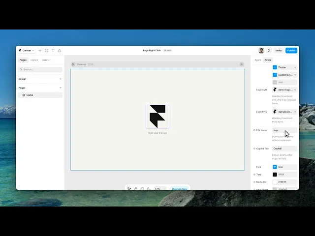
Right-clicking your logo opens a small menu offering the logo as a file — download the SVG, download the PNG, copy it to the clipboard.
It's a convention borrowed from companies with real brand guidelines, and it signals that yours are looked after.
Controls
27 controls, 4 of which only appear when they are relevant.
Control | Type | Default | Notes |
|---|---|---|---|
Logo | ResponsiveImage | — | Falls back to the SVG or PNG file when empty. |
Logo Width | Number |
| 24–800px |
Items | Array |
| — |
Action | Enum | Download SVG / Download PNG / Copy as SVG / Custom Link / Divider — default | — |
Label | String |
| conditional |
Link | Link | — | conditional |
New Tab | Boolean |
| conditional |
Logo SVG | File | — | Used by Download SVG and Copy as SVG items. |
Logo PNG | File | — | Used by Download PNG items. |
File Name | String |
| Download file name without extension. |
Copied Text | String |
| Shown briefly after Copy as SVG. |
Font | Font |
| — |
Text | Color |
| — |
Menu Fill | Color |
| — |
Item Hover | Color |
| — |
Divider | Color |
| — |
Menu Width | Number |
| 120–480px |
Menu Radius | BorderRadius |
| — |
Item Radius | BorderRadius |
| — |
Menu Padding | Padding |
| — |
Item Padding | Padding |
| — |
Item Gap | Number |
| 0–24px |
Menu Border | Border |
| — |
Shadow | BoxShadow |
| — |
Animation | Enum | Scale / Fade / None — default | — |
Transition | Transition |
| conditional |
Preview Menu | Boolean |
| Show the menu on the canvas for styling. |
Working through the panel
Setting it up
Logo is the image people see, with a width.
Then Logo SVG and Logo PNG are the actual files the menu hands out, and File Name is what they're saved as. Those are separate from the displayed logo on purpose — what you show on the page and what someone downloads for print are usually not the same file.
Items is the menu itself. Each entry has an Action: download SVG, download PNG, copy as SVG, a custom link, or a divider.
Custom link is how you add a line pointing at your full brand guidelines page. And divider is a separator — it takes no label, it just groups the items above and below.
The menu
Copied Text is the confirmation shown after a copy action — the small acknowledgement that stops people clicking twice.
Then the menu's appearance: width, radius, padding, border, shadow, and a fill colour. Items get their own radius, padding, gap and hover colour, plus a font and text colour.
Animation is scale, fade or none, and picking one of the first two reveals a Transition control for the timing.
Designing it
One control exists only for the editor: Preview Menu.
A right-click menu is hidden until someone right-clicks, which means you can't style it on the canvas. Turn Preview Menu on and it stays open so you can design it. Turn it off before you publish.
That's the one thing to remember about this component — a shipped site with the menu permanently open under the logo is a strange first impression.
Performance and limits
Static rendering is handled, so canvas thumbnails and exports show a settled frame rather than a blank box.
Good to know
No setup or coding required. Responsive across desktop, tablet, and mobile.
Refund policy — due to the nature of digital products, all sales are final. Once purchased, this component is non-refundable. Please make sure it fits your needs before completing the checkout.
Support: hi@alicorak.com