Documentation
What it does
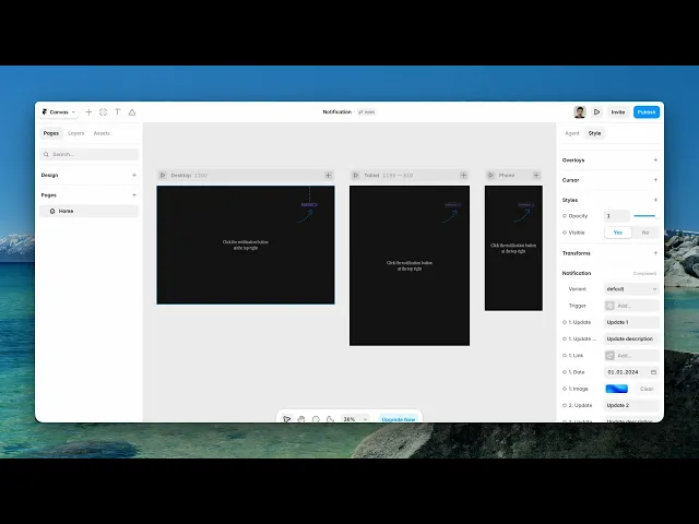
A bell that opens a panel of updates — three entries, each with a title, a description, a date, an image and a link.
It's the pattern people know from apps, used here to surface what's changed on your site without giving it a whole page.
Where you would use it
Perfect for SaaS dashboards, product changelogs, "what's new" announcements, web apps, and any site that needs a lightweight, native-feeling notification hub.
Controls
26 controls.
Control | Type | Default | Notes |
|---|---|---|---|
Variant | Enum | default / clicked | — |
Tap | EventHandler | — | — |
1. Update | String |
| — |
Onj Hfs0bld NChange | ChangeHandler | — | — |
1. Update Description | String |
| — |
Onrp GMabk NSChange | ChangeHandler | — | — |
1. Link | Link | — | — |
1. Date | Date |
| — |
Onx ZCJAa8b JChange | ChangeHandler | — | — |
1. Image | ResponsiveImage | — | — |
2. Update | String |
| — |
Onkh1 Y6b Hqu Change | ChangeHandler | — | — |
2. Update Description | String |
| — |
Onqg GHxg P H Change | ChangeHandler | — | — |
2. Link | Link | — | — |
2. Date | Date |
| — |
On B7r0 Yzu9 SChange | ChangeHandler | — | — |
2. Image | ResponsiveImage | — | — |
3. Update | String |
| — |
Ont COCFkv JMChange | ChangeHandler | — | — |
3. Update Description | String |
| — |
On Eo4xn Pz QKChange | ChangeHandler | — | — |
3. Link | Link | — | — |
3. Date | Date |
| — |
On O7 K23 YH9 WChange | ChangeHandler | — | — |
3. Image | ResponsiveImage | — | — |
Working through the panel
Filling it in
Each of the three slots takes the same five fields: an Update title, a description, a link, a date and an image.
Write the titles as things that happened, not as categories. New feature tells the visitor nothing; Dark mode is here tells them everything, and it's the same number of words.
Set the dates properly. They're what make the panel read as maintained rather than as a static block someone wrote once.
And set the links. An update that mentions something new but doesn't take you to it is a small frustration repeated three times.
States and events
Variant switches between the closed and opened states, which is how you design the panel on the canvas — the same problem every popover component has.
Set it to the opened state while you're styling, and back to default before you publish.
There's also a Tap event handler on the component, plus change handlers on each field, so something else on the page can respond when a visitor opens the panel or interacts with an entry.
Good to know
No setup or coding required. Responsive across desktop, tablet, and mobile.
Refund policy — due to the nature of digital products, all sales are final. Once purchased, this component is non-refundable. Please make sure it fits your needs before completing the checkout.
Support: hi@alicorak.com