Documentation
What it does
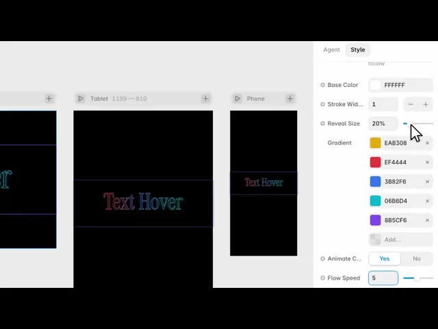
Your text sits dimmed on the page, and the cursor reveals a band of colour through it — a gradient that only exists where the visitor is pointing.
So the type is there the whole time, but the colour is something they uncover.
Where you would use it
Perfect for hero headlines, landing-page titles, portfolio intros, and any section where you want text that reacts to your visitors.
Controls
15 controls, 6 of which only appear when they are relevant.
Control | Type | Default | Notes |
|---|---|---|---|
Text | String |
| — |
Mode | Enum | Stroke / Fill — default | — |
Font | Font |
| — |
Smoothness | Number |
| 0–1 · 0 = plain easing (uses Duration), >0 = springy follow |
Duration | Number |
| 0–2s · conditional |
Base Color | Color |
| — |
Stroke Width | Number |
| .1–5 · conditional |
Idle Opacity | Number |
| 0–1 · conditional |
Hover Opacity | Number |
| 0–1 · conditional |
Reveal Size | Number |
| 5–100% |
Gradient | Array |
| — |
Animate Colors | Boolean |
| — |
Flow Speed | Number |
| 1–10 · conditional |
Glow | Boolean |
| — |
Glow Intensity | Number |
| 1–20 · conditional |
Working through the panel
Stroke or Fill
Mode is the first decision and it changes the panel.
Stroke draws the letters as outlines, which is the more distinctive look and works at large display sizes. It brings one control with it: Stroke Width.
Fill uses solid letters, and brings two — Idle Opacity and Hover Opacity, for how visible the text is before and during interaction.
Stroke for a hero word. Fill when the text also has to be readable as text.
The reveal
Reveal Size is how much of the text the cursor lights up, as a percentage. Small makes people hunt across the word; large lights most of it at once and the effect becomes a glow rather than a reveal.
Smoothness is how much the reveal lags behind the pointer. Higher feels liquid, lower feels precise.
And there's a detail worth knowing: take Smoothness all the way to zero and a Duration control appears instead. With no lag to smooth, the component times the reveal directly.
Base Color is the text at rest — the state before anyone touches it.
Gradient and glow
Gradient is the list of colours the reveal is made of. Three or four strong colours read better than a long list, because only a band of it is visible at any moment.
Animate Colors makes the gradient flow through the text on its own, with a Flow Speed control. It's worth turning on — it means the word is alive even when nobody's pointing at it.
And Glow adds bloom around the revealed area, with an intensity control. Use it on dark backgrounds, where it reads as light through glass. On white it just looks blurry.
Performance and limits
Static rendering is handled, so canvas thumbnails and exports show a settled frame rather than a blank box.
Good to know
No setup or coding required. Responsive across desktop, tablet, and mobile.
Refund policy — due to the nature of digital products, all sales are final. Once purchased, this component is non-refundable. Please make sure it fits your needs before completing the checkout.
Support: hi@alicorak.com