Documentation
What it does
It shows your logo as text, animates it while the page loads, and then clears out of the way to reveal the site.
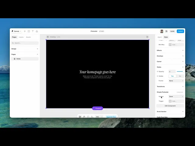
One control — a variant with three states — because a preloader has exactly one job and everything else is styling you already know how to do.
Where you would use it
It’s designed for simple, polished loading moments — perfect for portfolios, agencies, SaaS websites, product pages, and creative landing pages.
Controls
1 controls.
Control | Type | Default | Notes |
|---|---|---|---|
Variant | Enum | Loading / Done / Gone | — |
Working through the panel
The three states
Loading is the animation itself. Done is the moment it finishes. Gone is the state after it leaves.
You switch between them on the canvas to design each stage, which is the point of exposing them as a control — you can see and style the finished state without waiting for a page load.
On the published site the component moves through them on its own.
Getting it right
Two things decide whether a preloader helps or annoys.
Keep it short. A preloader that outlasts the page load is a delay you added, not a delay you covered.
And make sure the state it leaves behind matches the page underneath. The transition should feel like the site arriving, not like a curtain being pulled away from something unrelated.
Good to know
No setup or coding required. Responsive across desktop, tablet, and mobile.
Refund policy — due to the nature of digital products, all sales are final. Once purchased, this component is non-refundable. Please make sure it fits your needs before completing the checkout.
Support: hi@alicorak.com