Documentation
What it does
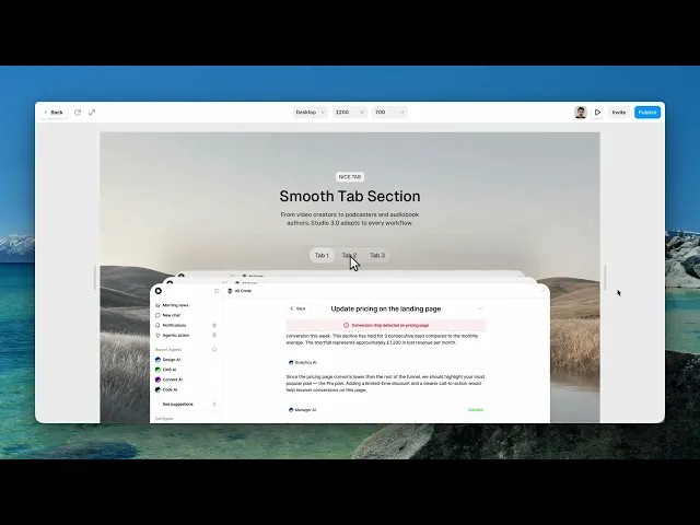
Three tabs, three images, and an animated transition between them — a self-contained tabbed section you don't have to wire together yourself.
Where you would use it
Perfect for SaaS landing pages, app previews, feature breakdowns, portfolio case studies, and interactive product sections.
Controls
11 controls.
Control | Type | Default | Notes |
|---|---|---|---|
Variant | Enum | 1 / 2 / 3 | — |
Radius | BorderRadius |
| — |
Tab 1 | String |
| — |
On U N VUq GRChange | ChangeHandler | — | — |
Image 1 | ResponsiveImage | — | — |
Tab 2 | String |
| — |
Onx6ftt D2 Zu Change | ChangeHandler | — | — |
Tab 3 | String |
| — |
Onmt Df UDl PWChange | ChangeHandler | — | — |
Image 2 | ResponsiveImage | — | — |
Image 3 | ResponsiveImage | — | — |
Working through the panel
How to set it up
There are three tab labels and three images, paired in order. Type the labels, set the images, and that's the content done.
Variant switches between three visual treatments of the tab row itself, and Radius rounds the panel.
Each tab also has a change handler, so you can trigger something else on the page when a visitor switches — useful when the tabs are driving more than just the image.
Getting it right
Two things worth knowing.
The labels should be short and parallel — three one-word labels read as a set, while a mix of one word and four makes the row look accidental.
And the three images should share dimensions. The panel keeps its size while the content swaps, so images of different shapes will crop differently and the transition draws attention to the mismatch.
Good to know
No setup or coding required. Responsive across desktop, tablet, and mobile.
Refund policy — due to the nature of digital products, all sales are final. Once purchased, this component is non-refundable. Please make sure it fits your needs before completing the checkout.
Support: hi@alicorak.com