Documentation
What it does
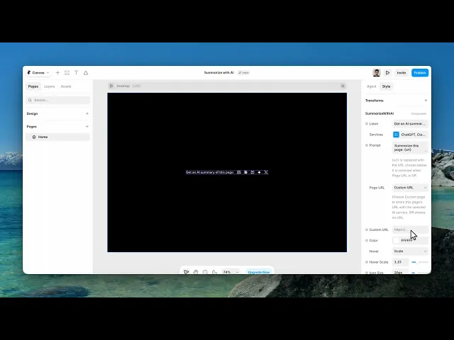
A row of icons that open your page in ChatGPT, Claude, Perplexity and others — with a prompt already filled in asking for a summary.
It's become a small convention on documentation and long articles, and it costs you nothing to run because the work happens in someone else's tab.
Controls
12 controls, 3 of which only appear when they are relevant.
Control | Type | Default | Notes |
|---|---|---|---|
Label | String |
| — |
Services | Array |
| — |
Prompt | String |
| {url} is replaced with the URL chosen below. It is removed when Page URL is Off. |
Page URL | Enum | Off / Current page / Custom URL — default | Choose Current page to share this page's URL with the selected AI service. Off shares no URL. |
Custom URL | String | — | conditional |
Color | Color |
| — |
Hover | Enum | Scale / Color / Fade / Lift / None — default | — |
Hover Scale | Number |
| 1–1.5 · conditional |
Hover Color | Color |
| conditional |
Icon Size | Number |
| 12–48px |
Gap | Number |
| 4–48px |
Font | Font |
| — |
Working through the panel
Services and prompt
Services is the list of assistants to show. Include the ones your audience actually uses rather than all of them — six icons is a row, three is an offer.
Prompt is what gets sent. The default asks for a summary, but you can make it anything: explain this for a beginner, list the key steps, extract the code examples. Match it to what your page is for.
And Label is the text beside the icons.
The page URL
This is the control that decides whether the whole thing works.
Off sends only your prompt, which means the assistant has nothing to summarise. Current page sends the URL of the page the visitor is on — that's the one you want almost always. Custom URL lets you point at a fixed address instead, which reveals a field to type it in.
If you set this to Off, the buttons open a chat that can't answer. Use Current page.
Styling
Colour, icon size, and the gap between them. Then a hover effect: scale, colour, fade, lift, or none — and depending on which you pick, either a scale amount or a hover colour appears.
Keep this restrained. It's a utility row that sits below your content, not a feature, and an energetic hover on six icons makes the bottom of your page busier than the article above it.
Performance and limits
Static rendering is handled, so canvas thumbnails and exports show a settled frame rather than a blank box.
Good to know
No setup or coding required. Responsive across desktop, tablet, and mobile.
Refund policy — due to the nature of digital products, all sales are final. Once purchased, this component is non-refundable. Please make sure it fits your needs before completing the checkout.
Support: hi@alicorak.com